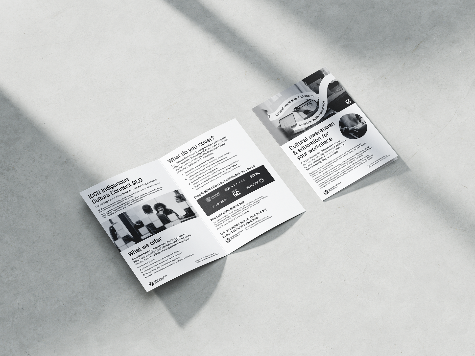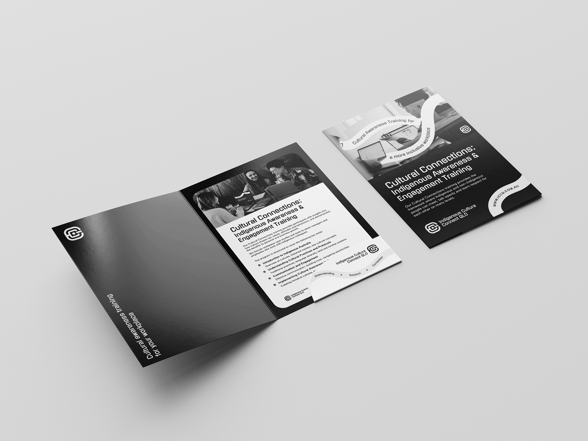
I developed a visual identity for a corporate cultural awareness company based in the Gold Coast, Queensland. This company offers Indigenous awareness and engagement training to government and large companies.
Indigenous cultural awareness training, sometimes known as Aboriginal cultural awareness training, provides an introductory knowledge of Aboriginal and Torres Strait Islander culture and appropriate ways of engaging with it.

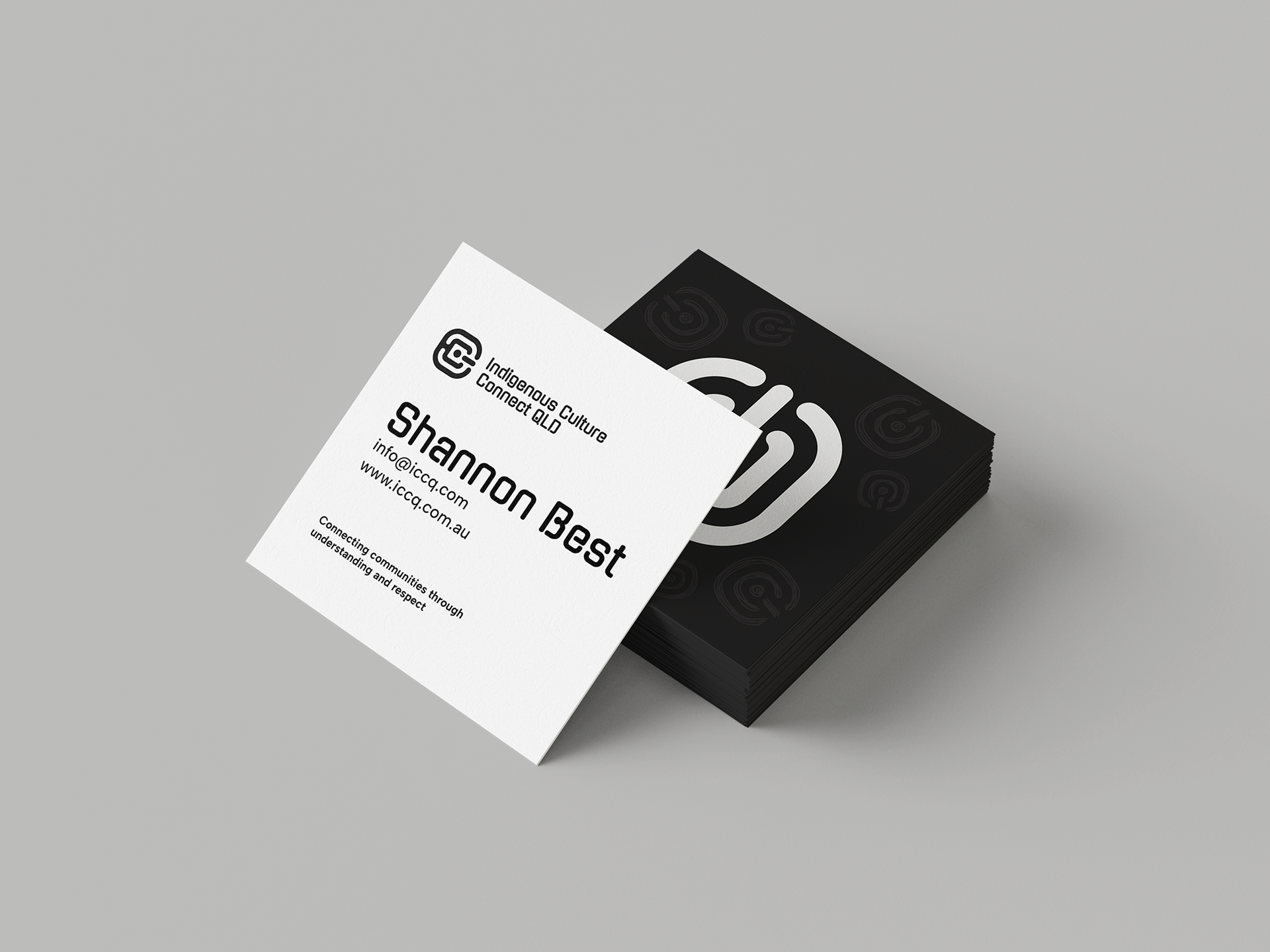
ICCQ wanted a simple yet corporate brand and logo. They wanted to avoid incorporating an Aboriginal look and feel like their competitors. Considering the company is about learning about Aboriginal and Torres Strait Islander cultures and appropriate engagement methods, I still wanted to respect that history. Based on my research and the meaning behind Aboriginal art and its symbols, I arranged the ICCQ letters to look like concentric circles, and I used the dot of the 'i' as the centre of the logo to resemble the 'meeting place' and have the two C's wrap around the dot, in a 'U' shape icon on its side.
Aboriginal people use symbols in their art to preserve their culture and tradition. Concentric circles represent many meanings in Aboriginal art, though they often share a specific site, waterhole, or meeting place. The crescent or 'U' shape icon represents people, both men and women and can be found in many Aboriginal paintings. One of the most iconic Aboriginal motifs is a symbol depicting people seated at a specific site, camp, or meeting place.
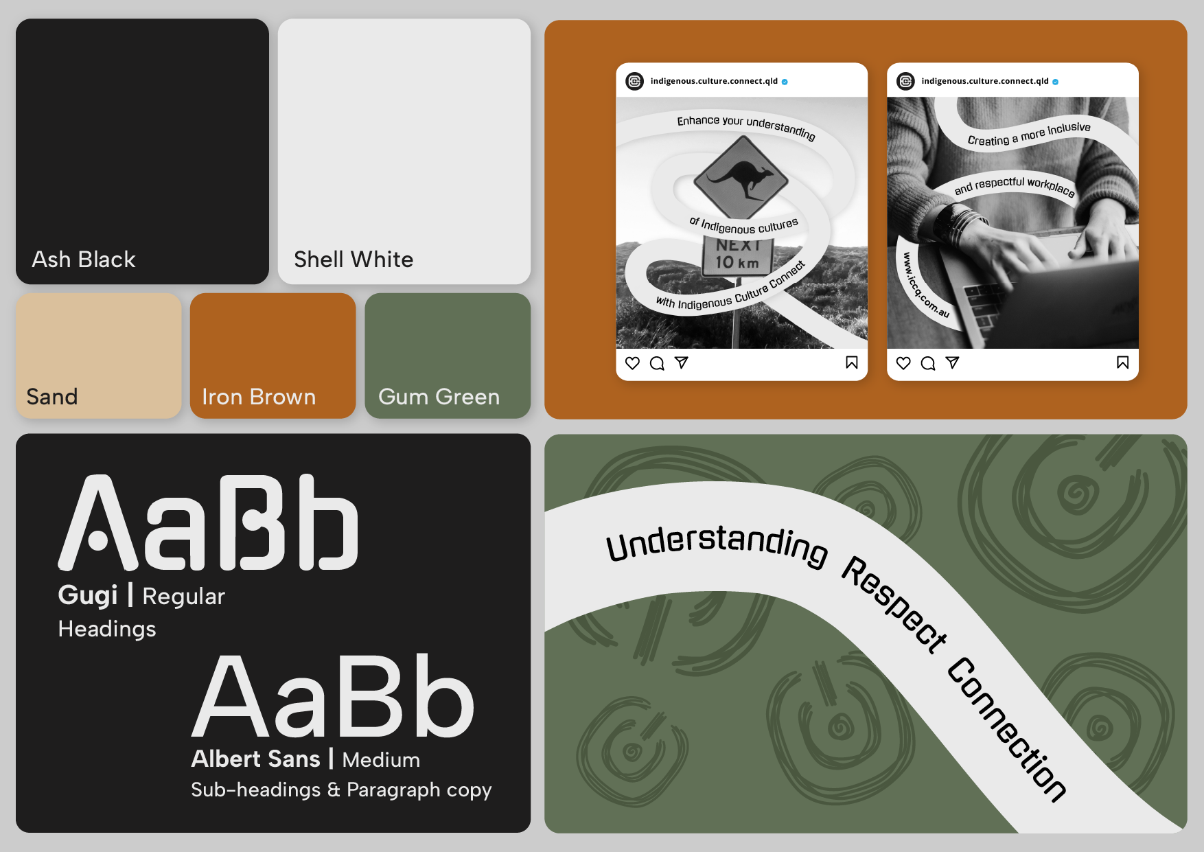
I used hand-drawn elements like wavy lines as part of the brand guidelines.
In Aboriginal paintings, long, wavy lines represent water running, a big part of the Gold Coast's extensive lake system.
In Aboriginal paintings, long, wavy lines represent water running, a big part of the Gold Coast's extensive lake system.